Order, made visible – a new brand and website for 20 years of M@RS
Twenty years in one platform – and a brand that never caught up.
Since 2006, Mediamid has been building M@RS in Vienna: a digital asset management platform that more than 500 organisations – from global car brands to public institutions, media houses and non-profits – use to manage around ten billion assets. Twenty years of continuous development, without the big migration that costs customers time and budget.
The brand had not kept pace. The signet had become too fine for favicons, email signatures and website headers. Turquoise was effectively the only colour, so a dark mode was impossible. And Mediamid and M@RS didn’t match, although they always appear together. The website, built in 2013 as an M@RS portal, was a good product example – and a poor salesman.
For the 20th anniversary of M@RS, we relaunched both: the corporate design and the website.

Evolved, not replaced.
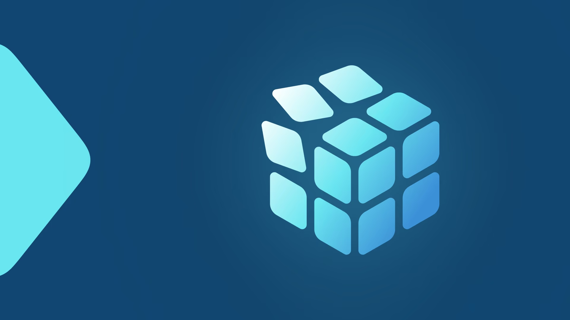
The brief wasn’t “make something new”, but “what still works, and what needs to evolve?”. The old signet already carried the right idea: turned, ordered squares – creating order, exactly what M@RS does. We kept the idea and gave it a body: an isometric cube in three blues, built from many individual parts, clearly sorted and legible at any size, from favicon to trade-fair wall.
The product mark is the core of that cube. Its three faces take up the three elements of the old red diamond, and the @ is now part of the wordmark. Both brands share one system:
- Colour: M-Blau and M-Türkis as primaries, M-Blau 2 and M-Dunkelblau as secondaries, plus two gradients – enough range for light and dark mode
- Type: Roboto throughout, a standard font, as Mediamid asked, so nothing breaks in implementation
- Image world: aerial structures and raked sand – order you can see
- Applications: logo versions for every background, favicon and app icon, icon set, business cards, email signature, website in light and dark mode
The brand manual was ready in May 2026, in time for the anniversary year.
A website that sells – running on the product itself.
A product website in 2026 is the first step of a buying decision that increasingly starts without a sales call. So we built the new mediamid.com around the questions customers really ask: what the platform does in detail, what the AI in M@RS takes over and what it doesn’t, how security, permissions and integrations work – and who you’ll be working with.
- Information architecture and UX/UI design: home, features, integrations, AI, service & support, customers, company
- Website copy, developed with the Mediamid team
- Light and dark mode, built on the new colour system
- SEO groundwork: page titles and meta descriptions, a clean redirect plan for the old URLs
- Built by Mediamid’s own developers on M@RS X – the website runs on the product it sells
Ready for the next twenty.
The new mediamid.com went live on 9 September 2026, together with an article on twenty years of M@RS, and is being rolled out page by page.
What the relaunch changes about how Mediamid works: nothing – partnership-driven, reachable, with software built to last. What it improves: the brand finally looks the way the platform works. Ordered, clear, made of many parts, legible at any size.
Twenty years of M@RS. Ready for the next twenty.
Stories we had time to turn into content


.avif)




You're here. So let's do this!
Evolve your established brand. Launch your startup. Bring a new product idea to market. Wherever you are in your journey – we're ready to build it together.